How To Create An Effective Referral Landing Page
You have considered all the critical elements of creating a great referral program for your brand. But, how are you going to promote it and attract your potential customers?
Enter: Referral landing pages.
A landing page is one of the most overlooked elements of a referral program. It is an essential marketing strategy that attracts target customers and encourages them to sign up for your program by mentioning the rewards and benefits they can get. In other words, it communicates the value of your referral program, explains how your program works, and makes the signing-up process straightforward.
This blog post will teach you how to create an effective landing page for your referral program so more and more customers can spread positive words about your brand.
- A catchy headline
- Mention rewards & benefits
- A compelling CTA
- Include attractive imagery
- Include a low-friction form
- Add social proof
- Add a FAQ section
- Easy navigation
On-Demand Video Course On Native Advertising
Boost your ROAS with native ads. Enroll now with our limited 30% discount.
8 tips to make a perfect referral landing page
1. A catchy headline
Let’s be honest: boring things don’t sell, and the most boring thing you can use on your landing page to drive away customers is the headline.
Headlines are the first thing people read when they land on your referral landing page. Hence, it’s your first and best chance to WOW them so that they’d want to learn more about your program. Of course, headlines aren’t your only tool to boost your conversions. Like images, videos, and other interactive elements, headlines can also communicate the idea of your landing page.
Therefore, it’s crucial to make your headlines as engaging as possible. Here’s how you can do it:
- Make sure to make it simple for readers to understand. Using complicated phrases can make it less appealing to customers.
- Be clear about the offer.
- Promise them a specific benefit from your referral program
- Keep it short and sweet unless you want to sound exaggerated or fake.
- Use power words, such as “magic”, “free”, or “amazing” to get people’s attention.
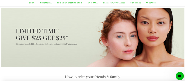
Check out how Tata Harper has used the cash rewards in their headline to attract readers’ attention:
2. Mention rewards & benefits
The next essential element of an excellent referral landing page is the reward customers will get from your referral program. When setting up a referral page, it’s crucial to state the reward right away. People want to know what they can get out of your program and whether joining your program is worth their time. So, it’s best to ensure that the reward is one of the first things visitors view on your page.
After you’ve captured your customers’ attention with an attractive reward, it’s time to convince them to join and share your program by mentioning its benefits. Why should the customers sign up for your program? How will they benefit from it?
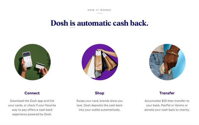
For example, Dosh did a great job in communicating the benefits of its referral program:
3. A compelling CTA
Your customers have landed on your landing page only to leave without taking any action. Why? Because you haven’t included a clear call-to-action on your page.
A CTA is something that takes the guesswork out of the process and lets the users know what they’re expected to do once they reach your landing page. In other words, a CTA allows them to share the word about your brand with their family and friends. Without it, they’re likely to leave your page and go to your competitor’s website.
However, not all CTAs are created equally. Some are compelling and actionable, while others are boring and complicated. Here, the best practice is to include a CTA that persuades customers to take the desired action.
“Register,” “Sign Up,” “Start Sharing Today,” and “Earn Now” are some examples of effective CTAs.
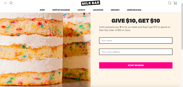
Milk Bar is an excellent example. It uses action words to motivate its visitors to “Start Sharing” about the program. Plus, the CTA is clear, is placed in a findable spot, and is catchy.
4. Include attractive imagery
People are visual creatures who process and respond to visual data much faster than other data types. Hence, it makes sense to put an attractive image on your landing page that can help viewers relate to your brand or product. Or it can also allow them to imagine themselves using and enjoying your product or service. This imagery aims to tell a story and evoke emotions among your customers.
Here’s how you can leverage images on your referral landing page:
- Use high-quality images as low-quality or resolution images show your unprofessionalism, and that isn’t something your customers can relate to.
- Avoid using multiple images on your landing page. Instead, have just one full-size main photo to capture the beauty of your product/service.
- Make sure the image is relevant to your brand. For instance, if you’re promoting smartwatches, using photos of flowers and cars as the hero shot won’t do any good.
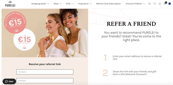
Check out this stunning example of imagery by PURELEI:
5. Include a low-friction form
Friction happens when an element on your landing page slows down the visitors and resists them from clicking the CTA button. In other words, they land on your landing page and leave without taking any action.
Since your referral landing page aims to get users’ attention and get them to sign up for the program, the best practice is to include a low-friction, simple form on your landing page to make it easy for them to refer friends.
Low-friction forms don’t have too many fields. Instead, they just have one or two fields that don’t take too much time to fill — mostly the prospect’s name and email address. This way, you can keep the sign-up process simple and collect only the essential information to connect with your customers.
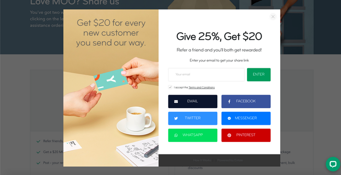
Check out this form by Moo. It’s simple and isn’t jam-packed with tons of information. Plus, it only asks you to provide your email.
6. Add social proof
When it comes to the landing page, social proof is evidence that other customers in similar situations have used the same product or service or joined the referral program and benefited from it. Social proof can take many forms, such as customer reviews, testimonials, star ratings, and case studies.
Since people are more likely to trust other people than brands, social proof can add legitimacy to your referral program. When people notice a large amount of engagement and positive reaction to your program, potential customers will think that your referral program is worth joining and the reward is valuable and simple to earn. This means more sign-ups and referrals from them.
On-Demand Video Course On Native Advertising
Boost your ROAS with native ads. Enroll now with our limited 30% discount.
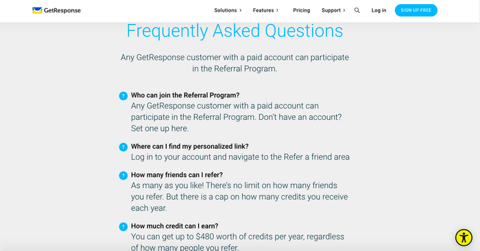
7. Add a FAQ section
FAQ sections are good-to-have elements on your referral landing page that can be used as a powerful marketing tool. These segments come in handy, especially when the referral program is quite complicated and has a lot of terms and conditions.
Instead of answering each customer’s query, you can set up FAQs to answer their commonly asked and repetitive questions without having them contact you directly or every time your prospect has a question. Further, FAQs allow marketers to provide detailed information about your program without including everything in the headline or blurb. Not to mention the time and effort it can save that they can spend on more crucial matters.
For example, GetResponse includes a FAQ section on their referral page to clarify details or handle objections.
8. Easy navigation
Navigation is another crucial element of your referral landing page. If your visitors are having a hard time navigating to and from your landing page sections and other web pages, say goodbye to referrals, sign-ups, and conversions.
The best practice is to make the option of your referral program visible on the navigation menu. You can add it as a separate option either to your website’s main menu or the menu at the footer. Whatever location you choose, make sure:
- It is noticeable to your website visitors. However, don’t go overboard with it, as you still want your main content to be the center of attraction.
- It is simple and doesn’t confuse the visitors, making them leave your landing page.
If you are unsure about your design, it is always a good idea to get some inspiration from looking at some great landing page templates. Top landing page builders like Unbounce, have plenty of templates to help you get started.
On-Demand Video Course On Native Advertising
Boost your ROAS with native ads. Enroll now with our limited 30% discount.
Wrap up
Referral marketing is an effective marketing tactic. However, it can only be successful if your landing page is compelling enough to entice customers to accomplish the desired task.
A well-designed referral landing page is critical to form a great first impression among customers about your referral program and get them to spread a positive word about your brand. It’s easy to create a landing page, but it can be complicated to create a great one.
In a nutshell,
- Write a catchy, attention-grabbing headline
- Mention rewards and benefits customers can expect from your program
- Include a robust call-to-action to let customers take an action
- Put up a central, hero shot image to make the page look appealing
- Include a low-friction form to decrease bounce rates and boost sign-ups
- Add social proof as evidence that people like your program
- Add a FAQ section to answer customer queries quickly
- Allow easy, noticeable navigation to avoid frustrating customers
Hence, make sure you follow the tips mentioned above to build a referral landing page that lets users know the purpose of your program. It should make the visitors confident about their decision to refer friends and not regret their “click.”