What Native Pro Dashboards Tell About Your Native Ad Performance
Your native advertising campaigns generate a lot of data which is difficult to analyze at a glance without reporting dashboards. With Native Pro, you’ll access insightful native advertising dashboards and keep an eye on your advertising performance at every level.
Our performance dashboards allow you to analyze and compare Taboola and Outbrain data in one place. These 12 well-thought dashboard templates are designed to help you get the most granular performance data split by any available level, and you can always customize or add widgets to your dashboards.
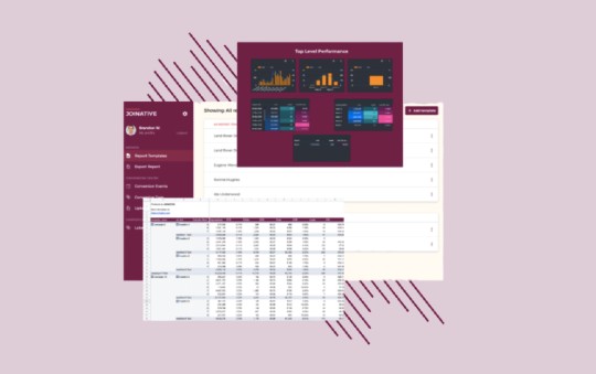
In our previous posts, we’ve already shown you how our native advertising reports look once they’re exported from Native Pro and how to work with our free advertising report templates. This time we’ll show you the dashboards we built for you to visualize the performance data effortlessly.
Wait, why use a reporting tool?
Both Outbrain and Taboola offer dashboards packed with campaign insights, so why do you need a separate tool to export your performance reports? There are quite a few reasons you might need it.
1. You have more time to focus on campaign optimization
Using Native Pro, you don’t need to spend hours exporting and manually bringing together regular reports for Taboola and Outbrain. Now you can manage all the reporting data from one single dashboard and spend the time saved to improve your campaign performance.
2. You can conduct and evaluate tests more efficiently
The Label Assignment feature allows you to tag elements you’re testing and access their performance data in separate dashboards.
3. You have all the conversion data at your disposal
It often happens that ad platforms and your custom BI solution show different numbers for the same metric. As a data-driven marketer, you need to consider all the conversion data at your disposal to optimize your campaigns based on the numbers you can trust.
With that in mind, we provide the Upload Conversion feature. Upload your conversion data coming from internal tools into Native Pro, and it’ll be available in your customized native advertising reports.
4. You have access to customizable performance dashboards
When you sign up for Native Pro, we create your own Joinative Google Drive for you. Here you have the advertising report templates collection and 11 customizable performance dashboards. We help you set up your reporting and assist you with further customization.
These are just some of the Native Pro benefits. We could go on, but it’s time to guide you through Joinative native advertising dashboards.
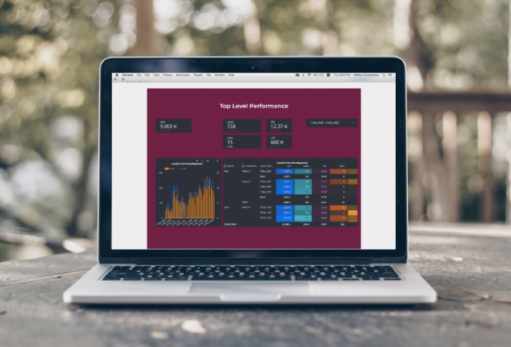
Follow your native advertising progress with the Overview dashboard
The very first dashboard is a summary of all the performance data across two platforms for a specific period.
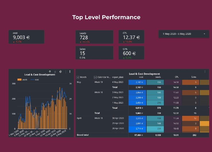
The boxes at the top display metrics for the time range you specify with the help of a drop-down calendar. As we selected the first five days of May, we’re seeing the overall cost, the number of leads and sales, CPL, and CPA for this timeframe.
Mind that the graph and the table aren’t controlled by this filter. Here you’re shown the data for all your campaigns for the last 12 months.
This dashboard allows you to evaluate what progress you’ve made towards reaching your goals since your campaigns started. The graph on the left visualizes how the number of incoming leads correlates with the total cost per day. In the right-side table, you see both standard and calculated metrics, such as cost, leads, cost per lead, sales, and cost per sale by day, week, and month.
Use case: From the graph, we see that although we’ve been attracting fewer leads for the last few days, campaign costs remained at the same level. This can either mean that we started to run tests and haven’t found a working setup yet or that we should immediately check out more granular reports.
Stay up to date with your native advertising spend
With the Native Performance dashboard, you’re always aware of your ad spend pacing.
To make sure you make the most of your campaigns, you should regularly monitor how your native advertising budget is being spent throughout the month.
The dashboard displays:
- your monthly budget;
- the sum your campaigns spent from the beginning of the month by this date;
- budget left for this month;
- campaign spend for the previous day;
- your daily budget for the specified date;
- the table with campaigns’ daily spend details, including the percentage of your daily budget spent by this time, cost, eCPM, and CPL.
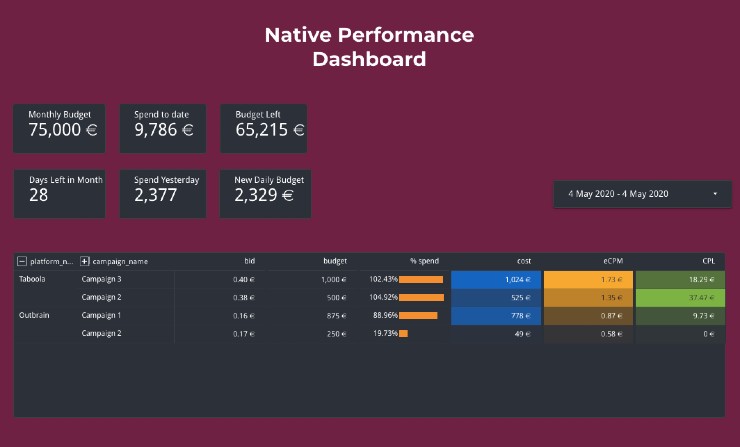
Use case: It can happen that testing different bidding options or lowering your CPC, you weaken the competitiveness of your native ad campaigns. As a result, your ads are shown less frequently and gain fewer clicks. Monitoring the Native Performance Dashboard, you can identify the issue and react promptly. Is the percentage of budget spent lower than it used to be at this time in the previous days? It’s a sign you need to check out the Campaign Performance Dashboard if you don’t want to lose impressions and clicks. This dashboard will tell you whether it’s your CPC that causes low impressions or your creatives that don’t deliver decent CTRs.
Compare Taboola and Outbrain campaign performance
The platform performance dashboard shows how your campaign performance differs depending on the native ad platform.
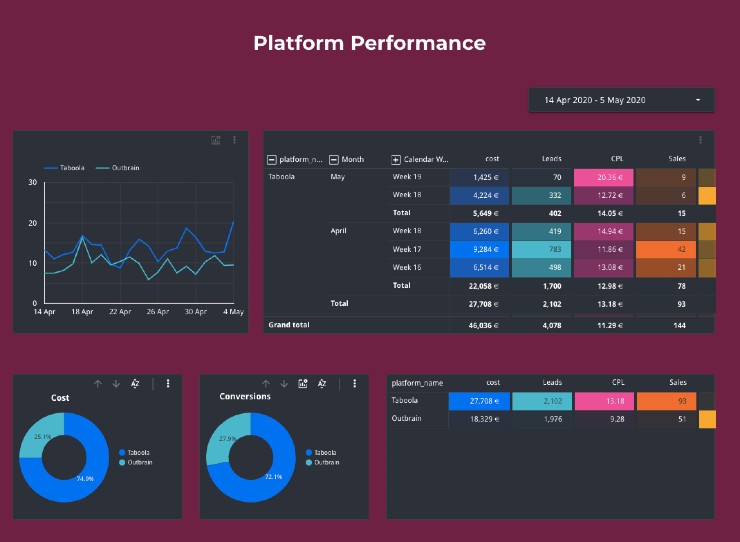
On the graph in the upper left corner, you see two curves that display how CPL for Taboola and Outbrain campaigns is changing over time. Based on what we see on our graph, we can say Outbrain campaigns are more successful in terms of reaching our goal CPL.
There are two tables available on this dashboard: the upper one shows a more detailed individual performance breakdown for Taboola and Outbrain, and the bottom table summarizes this data and allows you to compare overall platform performance.
Two donut charts in the left bottom corner illustrate the cost and conversion share for every platform.
Use case: We see that although Taboola has a higher CPL, it delivers more conversions for a lower CPA. This can be a reason to delve deeper into our reports and look into why Outbrain leads aren’t converting into customers as effectively as Taboola leads are.
Assign labels to evaluate the performance of campaign sets
The next three dashboards are great examples of the Label Assignment feature in action.
The first one is the Topic Performance dashboard. If you assign labels to campaigns that promote specific products, target similar audiences, share goals, or have any other similarities, you can compare how they’re performing against other sets of campaigns using this dashboard.
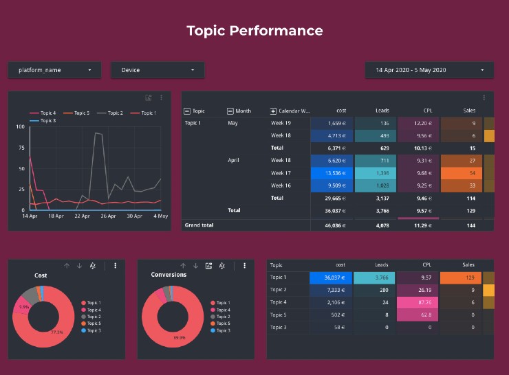
Use case: Do you have any hypotheses you want to check? The Topic Performance dashboard will help you monitor your test and see whether you’re right. Here are just a few ideas for how you can use this dashboard:
- With it, you can compare different targeting options and identify the most profitable audiences.
- It’s also a good idea to promote different products and use labels to see which ones deliver better results with native advertising.
- Not sure which bidding strategy will be the most effective? Assign labels to campaigns that follow one bidding strategy and check out whether there are any significant differences in their performance.
On-Demand Video Course On Native Advertising
Boost your ROAS with native ads. Enroll now with our limited 30% discount.

See how your campaigns are performing by device
Depending on your target audience, your native ads will perform differently on mobile and desktop. While younger audiences are more active on mobile devices, older users still opt for using their computers.
It’s highly recommended that advertisers split their campaigns by device types. If you follow this recommendation, you can assign different labels to mobile, tablet, and desktop campaigns and make sure you make the most of every device type.
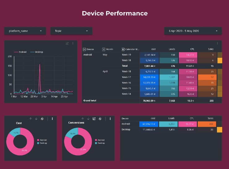
Use case: It’s fine that your native ads run on desktop devices lag behind the ones displayed on mobile. This dashboard not only helps you understand the obvious by comparing these two but also see your total performance for different devices and how it’s changing in time. If you want to optimize all your desktop campaigns, use this dashboard to monitor the effect of your adjustments.
Keep track of your ad and campaign tests
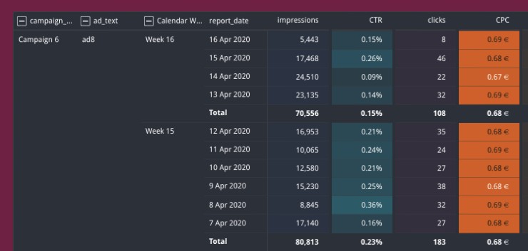
While two previous native ad dashboards are based on campaign-level labels, this one demonstrates the use of ad-level labels.
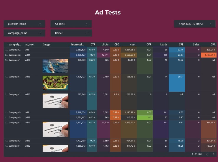
The table above includes campaign names, ad headlines, and images (if used) along with all the critical performance metrics, such as impressions, CTR, clicks, CVR, leads, and more.
Use case: We wanted to identify the best-performing combinations of thumbnails and ad texts. To track our tests, we assigned specific labels to every ad being tested. Now, the Ad Tests dashboard displays all the data for the specific label (you can select which labels you want to see in the table).
Do you want to compare black and white images against color images? Tag all the ads where B&W thumbnails are used with the ‘B&W’ label, and assign the ‘Color’ label to the rest of the ads. Do you want to add new headlines you never used before and see how they’re performing? Assign the ‘new headlines’ label to these new ads.
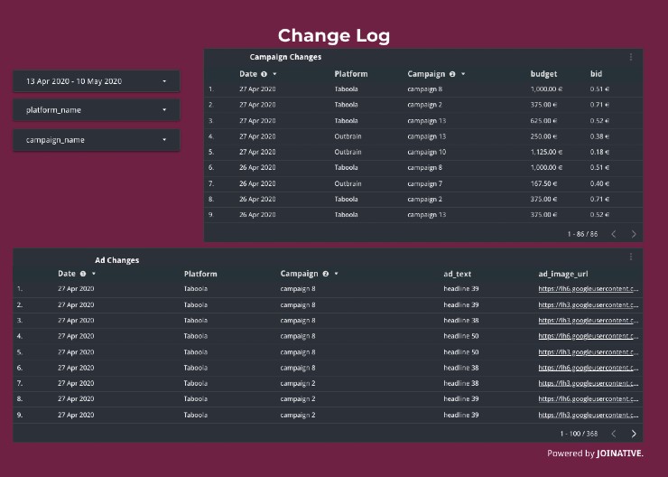
To keep track of all the changes you’ve been doing week by week, we offer you to check out the Change Statistics dashboards.
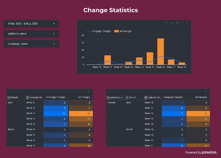
These two dashboards show:
- the number of campaign and ad changes;
- campaign and ad changes split for Taboola and Outbrain;
- a separate table for campaigns where the date of a change, platform name, campaign name, budget, and bid are displayed;
- a separate table for ads where the date of a change, platform name, campaign name, ad text, and ad image URL are displayed.
Monitor your performance on campaign and ad levels
Along with advanced analytics opportunities, we offer standard Campaign and Ad Performance dashboards. These granular reports allow you to get all the data needed to make informed decisions on the further campaign or ad optimization.
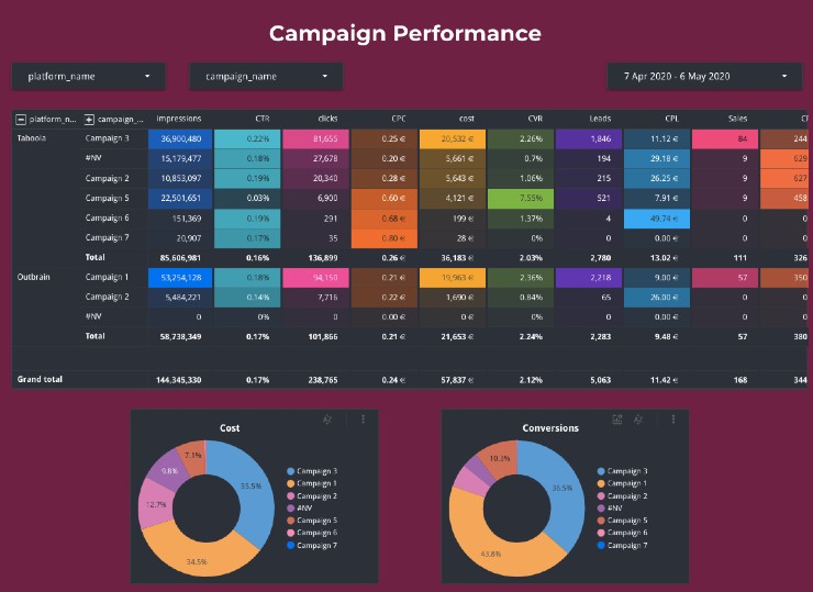
Check the Campaign Performance report regularly to spot any issues and make the necessary adjustments on the campaign level.
The Ad Performance dashboard is where you get the most granular reporting data. We don’t recommend that you make any conclusions on your campaign performance, without having a clear understanding of how different ads perform within these campaigns. Using different ads inside of one campaign, you might notice that particular ads have more effect over your campaign performance than others do.
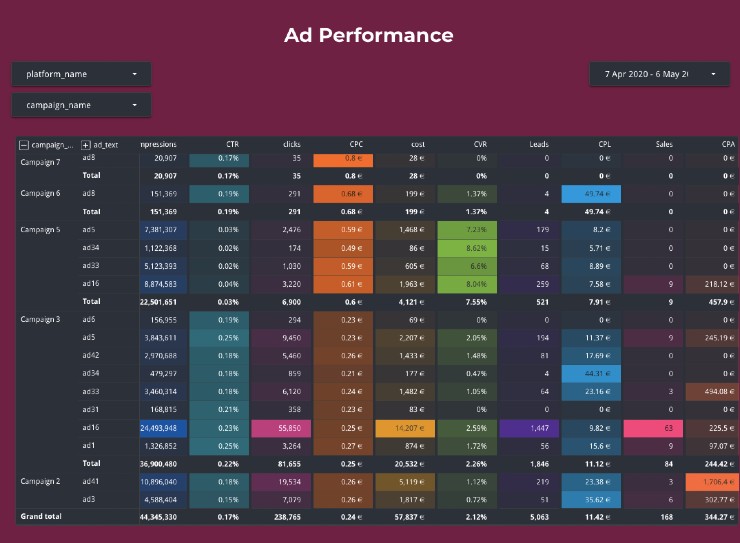
Note: With these reports, you can access the total data per ad/campaign for the selected period, week-over-week campaign/ad performance development, or day-over-day breakdown. To see week-over-week campaign/ad development, click on the ‘+’ sign next to the campaign/ad name. To unroll day-over-day data, click on the ‘+’ sign next to the ‘calendar week’ column.
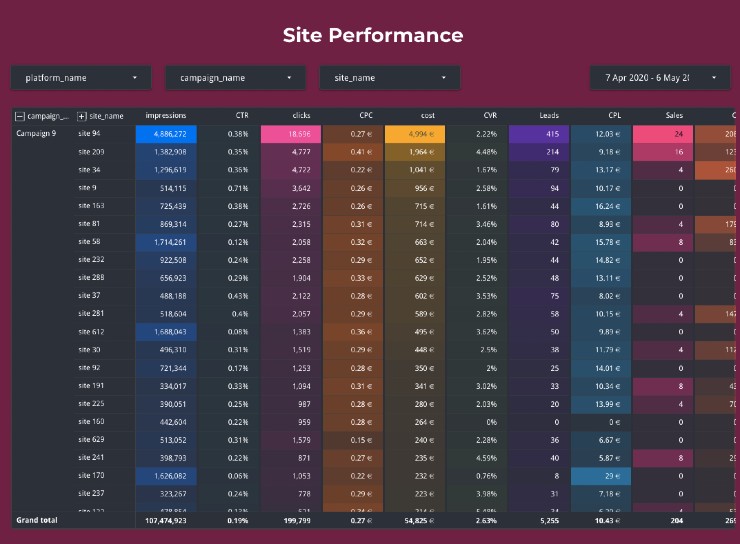
Identify best and worst-performing ad placements
Your ads are displayed across thousands of publishers’ websites. They won’t perform identically for every campaign you’re running. Some publishers might appear to be completely irrelevant and be wasting your campaign budget delivering low-quality clicks or leads.
Use case: With our site performance dashboards, you can see both the overall performance of a website or go more granular and how every site performs for every single campaign. We recommend that you start with the Site Total Performance report and identify sites that deliver a lot of traffic that never turns into conversions. Then, exclude these publishers for all your campaigns in Taboola and/or Outbrain.
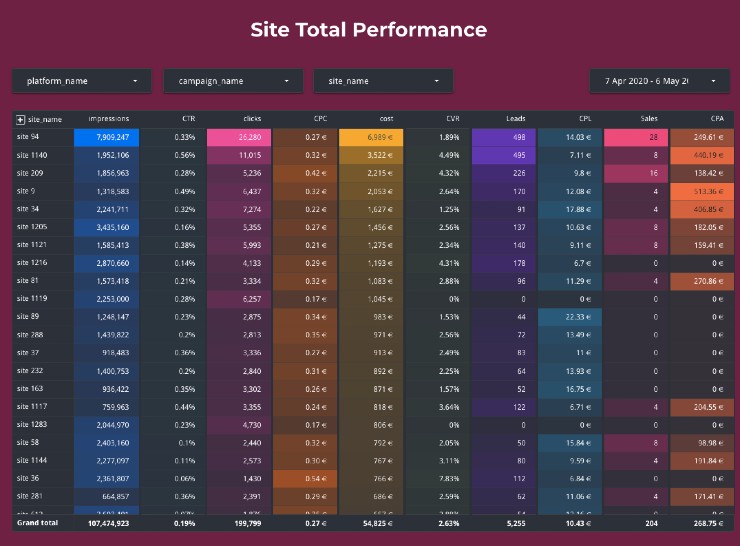
The next step will be checking how the rest of the publishers’ websites perform for every individual campaign. It can be that one website brings a great return on one campaign and just wastes your budget for another campaign. If you promote different products in separate campaigns, you should be cautious about it.
Pro Tip: You can create a new dashboard where you combine your site performance data with the device or topic labels to get insights on how publishers are performing for specific topics or devices.
The Site Performance report displays the engagement metrics every campaign delivers when being displayed on a specific website. Here you can see whether high-performing websites are equally effective for all your campaigns or you need to filter publishers by campaigns.
Take advantage of the data with Native Pro
With informative performance reports, you have everything needed to develop successful native advertising campaigns.
Sign up for a free 30-day trial of Native Pro today and access 12 pre-built native advertising performance dashboards.
Feel free to ask any questions over the live chat or contact us at hello@joinative.com.
Need help with analyzing your native ad performance? Check out our native advertising consultancy services.