Conversion Rate Optimization: How to Drive More Sales with Ads
Your ads attract a lot of traffic that hardly ever converts. Sounds familiar? Conversion rate optimization is what you need.
For those not involved in traffic arbitrage, a conversion is the final goal of your paid campaigns. Conversion isn’t necessarily a sale but any action you want a visitor to take on a landing page.
However, the effectiveness of paid campaigns can’t be measured by the number of conversions. As you pay for each click on your ad, it’s way more important to understand what percentage of campaign clickers actually take the desired action. This metric is called a conversion rate (CR).
A higher CR mostly means a lower cost per lead or sale. That’s why you need to keep track of this metric and always look for ways to increase it.
In this ultimate guide to conversion rate optimization, you’ll find:
- The process of conversion rate optimization explained
- A good conversion rate defined
- 11 Reasons for low conversion rates
- CRO best practices
All the tips in this article are backed by top marketers and CRO experts.
What is conversion rate optimization?
Conversion rate optimization (CRO) is a process of making adjustments to marketing assets in order to increase the percentage of people who take a desired action after interacting with the asset.
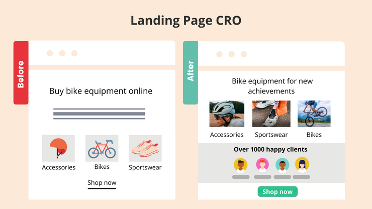
A marketing asset is any written, audio, or video presentation of branded information a prospective customer interacts with. Since we’re explaining CRO from the advertisers’ perspective, we’ll focus on assets like ad creatives and landing pages.
3 Can’t-miss benefits of conversion rate optimization
Why is conversion rate optimization important?
- It helps you increase the ROAS. CRO is your way to increase revenue per customer and make the performance speak for itself.
- It helps you drive more sales without increasing your advertising budget.
- It helps you improve advertising campaign performance without spending time on creating completely new marketing assets. All you need to do is to revisit and optimize what you already have.
What’s a good conversion rate?
Across industries and advertising channels, conversion rates vary a lot. According to the research by Wordstream, the average CR across industries is 9.21% for Facebook Ads, 4.40% on the Google Search network, and 0.57% on the Google Display network.
Vehicles and law verticals are seeing the highest CR on paid search, reaching 7.98% and 7.45% respectively. Fitness, education, and employment are the best performers on Facebook Ads – the average conversion rates in these industries are 14.27%, 13.58%, and 11.73% respectively.
The B2C Retail Benchmark Report for Q1 2021 has shown that the average CR for B2C ecommerce was 2.6% for paid search campaigns and 0.3% for display ads.
Regardless of the average numbers in your niche, the only benchmark you should be focusing on is your campaign CR and its growth. Say, you’ve reached the maximum CR stated in one of the benchmark reports. Does it mean you should stop working on improving it? Of course, not.
On-Demand Video Course On Native Advertising
Boost your ROAS with native ads. Enroll now with our limited 30% discount.
Why your conversion rate is low
We’ve just stressed that there’s no such thing as a benchmark for low or high conversion rates. Not only every vertical but also every single company with its peculiarities will have their own data to build their goals and strategy on.
So how do you figure out your conversion rate is low? The key indicator of low CR is campaign’s cost per action (CPA). How close is it to your goal CPA?
Note: Cost per action is calculated as the overall campaign spend is divided by the number of conversions being measured.
The higher your actual CPA is above your target CPA, the less cost-effective your campaign is. And if you aren’t getting any closer to the goal CPA, quite often there are very basic ‘conversion killers’ that can be easily identified and fixed.
Reason #1: You didn’t give your campaign enough time
This is a very common issue for advertisers who start running campaigns on a new advertising platform. In our experience, it’s especially true for native ad campaigns.
Outbrain’s Katarina Ereš explains: “Have you given your campaigns enough time? As with any other channel, you will need to get accustomed to native advertising. We recommend 4-6 weeks for testing depending on the preparation, the use of creatives and the setup of your campaign. Of course, you might see the conversion rate improve even earlier, but we see that for most clients, campaigns live up to their full potential after a few optimizations and a few weeks of testing.”
Reason #2: Landing page content doesn’t match the ad headline
It’s so difficult to attract users’ attention to your ad copy. The banner blindness phenomenon makes it even more challenging – now even the most relevant audiences tend to unconsciously ignore any banner-like content.
To avoid it, advertisers make their ads look as aligned with the rest of the publisher’s content as possible. The most common technique is creating headlines where the problem is defined and some solution is implied. Expecting to find content on the topic, users click on the ad only to see the product landing page.
More often than not, advertisers risk to fall into their own traps.
In the image below, you can see a native ad and a landing page associated with it. While it’s implied in the ad that you’ll find some guide to developing an academic career on the landing page, you don’t see anything that connects the landing page content and the ad headline when you click the ad.
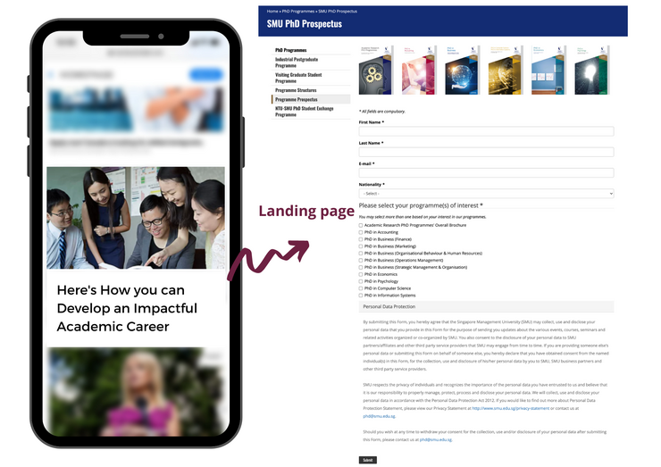
The company should have made it more clear why visitors need to fill in the form. Before they take this step, they might be losing tons of leads.
Enticing people to click, these ads boost click-through rates and drive a lot of traffic to landing pages. However, not being able to meet users’ expectations, these campaigns hardly ever result in conversions.
Note: The disconnect between your ad copy and landing page might take place even without your intention. If you are running multiple paid campaigns across different ad platforms, you could accidentally choose the wrong page for the specific campaign.
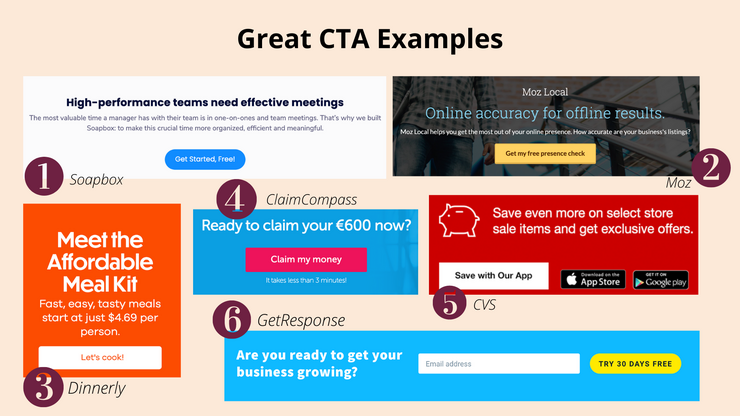
Reason #3: The CTA isn’t descriptive enough
CTAs like ‘Learn more,’ ‘Install now,’ or ‘Buy now’ are popular, but they’re also very generic.
It’s crucial that the text on the CTA button is clear and specific to the action required from a visitor. It’s also a good idea to highlight the value proposition in the CTA.
Below we’ve provided the example of a CTA that’s not only generic but also completely irrelevant. On the landing page, you are offered to get a personalized meal and workout plan. The CTA says ‘Install now’, which means there’s an app behind it. Once you click on the button, you land on a page with a quiz.
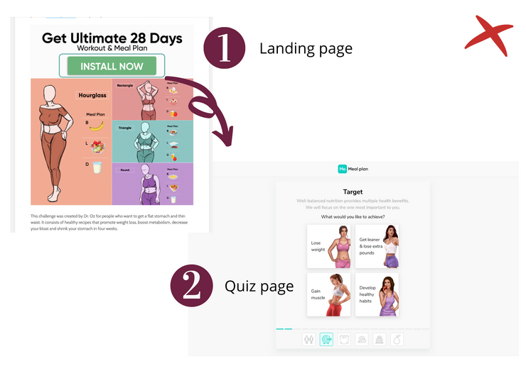
If the advertiser had used a more relevant CTA, they wouldn’t have lost leads who might not be willing to download the app right away but open to taking the quiz.
Reason #4: Poor design and inconsistent structure
A neat, well-thought design is another vital element for any landing page. It boosts trust, creates focus, and helps to highlight the most important aspects.
The page below would drive more signups if basic design best practices would have been followed.
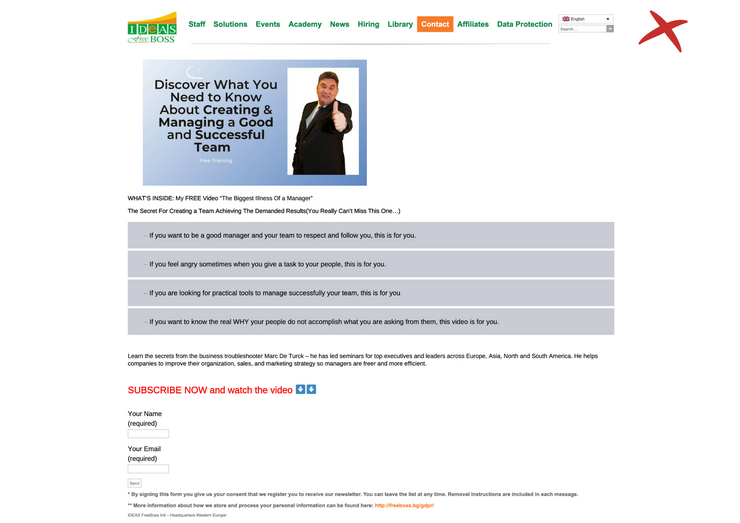
Landing pages that lack a logical hierarchy look confusing. A high-converting landing page is the one that answers all the questions arising as a prospect scrolls down the page.
Ideally, sections are put in the following order:
- Headline (value proposition). E.g. ‘Turn your website visitors into happy customers.’
- Pain points. E.g. ‘Losing 98% of your visitors?’
- Solution. E.g. ‘With our lead gen forms, you’ll lead your audience right into the dales funnel.’
- Objections. E.g. ‘Have no experience with lead gen campaigns?
- Objections addressed. E.g. ‘Don’t worry, our team has already helped 250+ companies to get started.’
- Call to Action. E.g. ‘Let’s Build Your First Campaign!’
Reason #5: The abundance of distracting elements on the page
The navigation bar, pop-up banners, multiple CTA buttons, and hyperlinks are elements that distract your visitors from taking action, not helping to convert them.
Katarina Ereš stresses it’s crucial to remove distractions to boost campaign CRs: “Are you using too many CTA buttons or the “wrong” ones? Too many different CTAs can distract the user from the conversion you really want.”
Remember the ‘one campaign = one goal’ rule. You might think additional information helps to retain people that are still at the early stages of the customer journey, but in fact any element not related to your main goal is a distraction.
Reason #6: Your built-in form requires too much information
Do you really need all that information asked in your lead capture form?
Data is great. But if you overdo, you won’t have any data at all.
“Presence of unnecessary elements, especially the not-so-important form fields badly hurts the conversion rate of your landing page. So, remove any unnecessary form field and keep only the essential things on your landing page. Removal of each form field from the landing page will increase the conversion rate by nearly 10% for sure,” explains Andrei Vasilescu, CEO and Digital Marketing Specialist at DontPayFull.
The amount of information you ask for should be compensated by the value of your lead magnet.
Most often, you need the lead’s first name and email address. For b2b, you’ll also need a company website.
To collect more information, use progressive profiling. With the method, you’ll be gathering additional data every time a previously converted lead accesses a new form on your website. Progressive profiling forms automatically replace fields with the ones a person hasn’t filled yet to capture new information every time.
Reason #7: The lack of social proof
Have you heard of the word-of-mouth marketing? The best way to promote your product is to make your customers speak about it.
This rule can be applied to your landing pages. When there’s no social proof on a page, you’re losing about one-third of prospective customers.
Brian Robben of Robben Media notes: “Lack of social proof is often a leading cause for poorly converting landing pages. Even with a strong offer and an interested prospect, you need third-party evidence to get most buyers over the hump. There are just too many options across the internet to take a chance on your product or service, when others are showing evidence they deliver on their promises.
Adding social proof in the form of a case study, reviews, video testimonials, or quotes will make the biggest jump in your conversion rate. Obviously, the more convincing the social proof, the better.”
70% of customers check out and trust reviews displayed on landing pages. Testimonials, case studies, social media takeovers and other forms of social proof are the most powerful trust signals that boost landing page conversion rates.
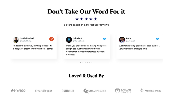
If you look at the Elementor’s landing page that’s promoted across Facebook, you’ll find as many as three forms of social proof: a rating, customer testimonials, and customer logos.
Reason #8: The value proposition isn’t clear
No matter how fancy your landing page is – when it’s not clear how your product or service benefits visitors’ lives, you won’t make them convert.
“Very few companies can communicate their value proposition at a world-class level. The average company relies on cool phrases and tag-lines that sound good but convert bad. Focus on communicating your value proposition very clearly until you nail it.
Talk to your customers directly if you can – evaluate if they understand what you are offering. Add live chat to help the ones who can’t find what they are looking for. When you speak the language of your prospects, you will write a high converting copy,” shares Ben Bitvinskas from Atlasmic.
Mastro Commerce’s Carmine Mastropierro stresses the importance of creating sales copy that addresses your customers’ problems: “One of the first things I would investigate in the case of low conversion rates is sales copy. While design, user experience, and other elements can be tweaked for performance boosts, copywriting is the quickest and easiest.
Every part of the funnel includes sales copy. If it isn’t communicating benefits, value propositions, the offer, or targeting customer pain points, conversion rates can plummet. I recommend businesses to audit their sales copy to ensure that it speaks to one audience, their feelings, beliefs, and desires. Position the product as the solution to their problems and you can easily see a boost in conversions.”
While you care about your product and what it does, your customers care about their problems. So, instead of focusing on what you offer, tell what a customer gets.
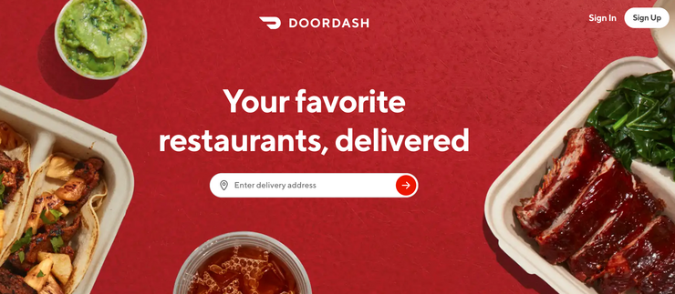
The rule not only relates to product landing pages but can be applied to lead generation campaigns as well. Are you offering a webinar? Give a user a reason to sign up for it right in the headline.
While a headline like ‘A Free Webinar On Driving Revenue With Content’ seems to be fine, the same webinar would gain way more traction if you use the following title: ‘Learn How to Grow Your Revenue With Content In 5 Simple Steps [For FREE].’
Reason #9: You don’t consider user intent
“A common reason why your conversion rates on paid ads are low is due to not correctly addressing your potential customer’s intent. We here at MAXBURST interpret the intent by using the keyword planner tool built into AdWords.
For example:
- “Buy charcoal bbq” signifies wanting to make a purchase
- “charcoal bbq reviews” indicates not quite ready to purchase
- “Cheap charcoal bbq” is most likely still researching the purchase
Maintaining the customer’s intent between the keywords and landing page is critical in addressing user intent. You need to ensure that the message is clear and stays the same from keyword to ad to the landing page. A cohesive message will provide an increase in conversion rates on paid ads.” – Andrew Ruditser, MAXBURST.
Reason #10: The message of your ad doesn’t match the query
This issue is related to paid search campaigns. Whenever you pick keywords for your ads, you need to make sure they match the message your ad headline conveys.
Datis Mohsenipour from HeyOrca says: “I’ve found that message match is something that is often overlooked in many paid campaigns.
Advertisers might be inclined to stuff a variety of keywords into one campaign and tie them back to generic ad copy, but this is a surefire way of leaving money on the table. While this might save you some time, it will inevitably lead to a lower CTR and Quality Score - ultimately, leading to a higher CPC and CPA.
For example - let’s say the user is searching for the query “Red Nike Cortez Shoes for Men.” They would expect to see results that tie back directly to their search results. When I search this, one of the top paid results that appears for me has no mention of “Nike”, “Red” or “Men” in the headline, and the description text is a generic blurb about the company.
While this might seem like a daunting task, there are functions built into Google Ads that allow you to dynamically update your ad copy based on the search query. They can be used for things like inventory counts, products, brands, colors, price, etc.
I’ve used them successfully in the past for location-based ads and keyword synonyms. We connected these ads to Unbounce Landing pages with Dynamic Text Replacement. From start to finish, the ad journey’s message matched the user’s query. Our click-through-rates and conversion rate increased significantly from doing so and it took a fraction of the time it would have taken to manually create hundreds of location-based campaigns.”
Reason #11: The campaign goal isn’t aligned with the buyer’s journey
Even though this issue is the last on the list, it’s one of the most common reasons for low conversion rates.
Do you want campaign clickers to take action typical for the bottom of the sales funnel? It can be a purchase, download of a paid app, subscription, or any other action that requires commitment. In this scenario, targeting broad audiences is the wrong technique.
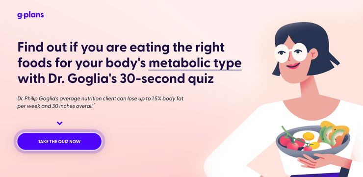
Revisit your campaign goal, content, and target audience. How relevant is your landing page for people that come across your company for the first time? Add one or a few extra steps to your strategy. Lead magnets, like a quiz below, can be a good solution to driving more relevant people to your sales funnel and growing your CR.
How to increase conversion rates of a paid campaign
Now, when you have learnt the most common issues causing low conversion rates, let’s have a look at the following CRO best practices.
Identify problem areas first
Evaluating the performance data of your current campaigns is the starting point for the CRO process. Basically, that’s why it’s called ‘conversion rate optimization’ – you revisit and optimize what you already have, aiming to improve the results.
Before you come up with ideas for adjustments, you need to map out and track each step that leads to a conversion. Check interactions with links, CTA buttons, form fields, and then calculate CVRs between all steps, identify where you loose the most people and focus on tests that can address that specific step.
What factors should you pay attention to?
The number of impressions and clicks.
Your ads might be getting 1K clicks a day that result in 10 conversions. This means that your CR is 1%. It can also be that your ads drive 100 clicks that deliver 1 conversion. The CR is still 1%. However, these are completely different scenarios.
In the first scenario, the problem is the disconnect between a catchy ad that drives a lot of clicks and a low-converting landing page. The second case might just mean your campaign hasn’t been getting a lot of traction and therefore hasn’t reached relevant audiences yet. The issue could be solved by creating a more engaging ad or/and increasing your campaign budget.
CPA.
We’ve already said that you can’t say whether your conversion is high or low by itself. However, the cost per action is the best indicator of your campaign effectiveness. For a software development company where the cost per project exceeds $10K, the CR at 1% could be a very good result.
If your campaign CPA has met your expectations, you’ll need to be careful with any adjustments you want to make. Run tests on ad groups before you change the working set-up of your best-performing campaigns.
Heat maps.
Still doubt that a few extra links on a landing page might be hurting campaign performance? Use a heat map.
Heat map data will show you what areas of your landing pages are viewed and clicked most often. By understanding which elements get the most attention, you can make more informed decisions about adding or removing certain features.
On-Demand Video Course On Native Advertising
Boost your ROAS with native ads. Enroll now with our limited 30% discount.

Types of heat maps:
- Click tracking maps. This type helps you identify whether your visitors are clicking links you want them to click (namely, CTAs), or they get distracted by other page elements.
- Scroll maps. Even if a user doesn’t take any action on your landing page, it doesn’t mean your offer isn’t relevant for them. By checking a scroll map, you can see at what point users abandon your page, form a hypothesis on the reason, and come up with an idea for an A/B test to prove it.
- Mouse movement tracking maps. Hover maps show visitors’ mouse cursor movements on your landing page.
- Attention tracking maps. These heat maps indicate which areas of the page have been viewed the most, based on the scroll depth and the time spent on the page.
Get more specific with your targeting options
Conversion rate is the relationship between the number of people who click on your ad and the ones that convert.
Trying to avoid narrowing down your reach, you might have selected too broad audiences to target in your campaign. But what’s the sense in displaying ads intended for people who are actively looking for the solution to their problem to audiences who have never encountered it?
If you try targeting a more specific group of people, you’ll see higher engagement and conversion rates.
Craft customer-centric ad copy and landing page
The key to growing conversions is understanding what your customers actually want. Address their pain points in your ad copy and landing page, and they won’t bounce.
It might be that your vision of the benefits your product or service offers don’t match the value your customers get from it.
Say, John builds a marketing strategy of their meal delivery company on the fact their meals are the most affordable on the market. He had never questioned this value proposition. But then Emma, the marketing manager John had recently hired, suggested that they run a customer survey. The results have shown that 65% of customers prioritize delivery speed over the price.
If you haven’t done so yet, go research your customers’ real pain points. Survey your customers. Talk to your sales team to learn about the most common objections your prospects have. Have a look at previous marketing campaigns and check what messaging resonated best.
DelightChat’s Deb Mukherjee recommends to use customers’ feedback as a base for landing page content: “Most landing pages that you see everyday are guesswork from the copywriter at worst and 3rd party research at best.
At DelightChat, we make it a point to talk to users before we publish content on our website. We take phrases from our customer interviews, polish them, and stick it on the page. It’s authentic and says exactly what the target audience wants to hear.”
Carolanne Mangles, CRO Specialist at Miromedia says crafting customer-centric copy is one of the most important steps of the CRO process for PPC. She says: “Ad copy needs to be relevant.
Paid ads copy is essentially a simplified unique value proposition. But, because of the character restriction, your UVP needs to be fewer words.
Tailor your copy to the mind-set of the searcher.
There is no point shoehorning in ad extensions and generic product benefit call-outs if you haven’t got the basic value proposition correct.
As with any copy that is created, it needs to be customer-centric. You can only create customer-centric copy if you actually speak to your customers, conduct research and get true voice-of-customer feedback.
Find out why your customers came looking for your particular solution (what problems they had and what they hoped to achieve) and then you’ll know what drives them psychologically when searching online.
Listing your service/product benefits is great, but without the main value proposition that speaks to them emotionally your ads are not going to stand out against the others at the top of SERPs who have the same or very similar product features and benefits.
Think about whether your customers for that particular keywords/ phrase are looking for a solution to achieve enhancement or eliminate pain and tailor copy accordingly.
Too many businesses formulate their ads title with “Product Name - Business Name - Generic Benefit” why not try a title that is more “[achieve specific desire] with [product type]” or [eliminate problem] with [product type].”
Know who you’re speaking to, and then you’ll know what to say.”
Align your ads and landing pages
Once a user clicks an ad, they should see a page that clearly reflects the promise given in the ad headline. Ideally, you’ll want to use the same headline across your ads and landing pages.
Alexandra Cote from MKT Odyssey says: “Beyond your ad’s text, you want to make sure the landing page matches the promise you make in the ad. If the ad aims to display you the best tool for your needs, people will expect to see a more detailed review of the product, right? Don’t just lead people to your homepage or pricing page.
You’ll also want to keep consistent branding between your display ads and your landing pages. Use the same colors, fonts, images, and voice to increase a person’s trust in your company.”
Bruce Hogan, Co-founder & CEO of SoftwarePundit also thinks it’s essential to align ad and landing page content: “The best practice for increasing the conversion rate of paid campaigns is ensuring that the copy & content from an ad and landing page match. The phrases used in the paid ad should be repeated in high-visibility locations on the landing page.
For example, if an ad appeals to some specific customer problem, your landing page should address this problem. If an ad highlights a specific benefit of your product or service, your landing page should reinforce this benefit.
Having consistent copy and content ensures that the customer journey stays relevant and does not confuse the potential customer.”
Always search for a way to reinforce the headline
Your visitors won’t read every word on your landing page. But they will read the headline. That’s why most of your campaign clickers don’t scroll any further than the header section. There’s no hook in the headline.
Your headline should appeal to your buyer persona, not just any user. Be specific. Highlight the value proposition. Make it clear what you offer. It’s also a good idea to use an action word in the title.
A/B test your ads and landing pages
“Get in the habit of A/B testing. Regular A/B tests help you determine which of two ads are generating more conversions. This kind of testing gives your customers a voice in the design and copy process because you choose which is more effective for them. It also allows you to spend your budget where it really counts. Long term, you will learn which elements work best for your specific audience,” recommends Pushnami’s Ashley Amber Sava.
Katarina Ereš says you need to test different landing pages across different advertising channels:“Are you using customised landing pages for Native or just your Display pages? Also do some A/B testing here. Small changes like the change of the CTA button color can have a tremendous impact.”
It’s tough to know which elements are performing well until you test them.
How to run A/B tests?
1. Create a hypothesis. After you have a look at your campaign performance and heat maps, you’ll make a few assumptions on what might help you to improve the results. For instance, seeing your page visitors bounce right after they start filling in the sign-up form, you can assume the submission process takes too much time. Your hypothesis will be: Reducing the number of form fields will help me increase conversions.
2. Copy your landing page and adjust the element that you’d like to test. It’s important that you change one variable at a time so that you see whether there’s any effect of this specific adjustment or not.
3. Once your results have reached statistical significance, analyze the data and pick a winner.
A/B testing ideas:
- With and without pricing;
- Different CTA placement;
- Different CTA texts;
- With and without navigation bars;
- Short and long sign-up forms;
- Stock and real-life images;
- Layout colors.
CRO is a continuous process
Doing CRO for paid campaigns takes a deep understanding of your target audience as well as a lot of testing. Step-by-step you’ll be able to increase your conversion rates and reach your campaign goals.
Joinative is a native advertising agency. If you need help with launching or optimizing your native ad campaigns, get in touch with us today.

 Feed
Feed
